Matra Matcha
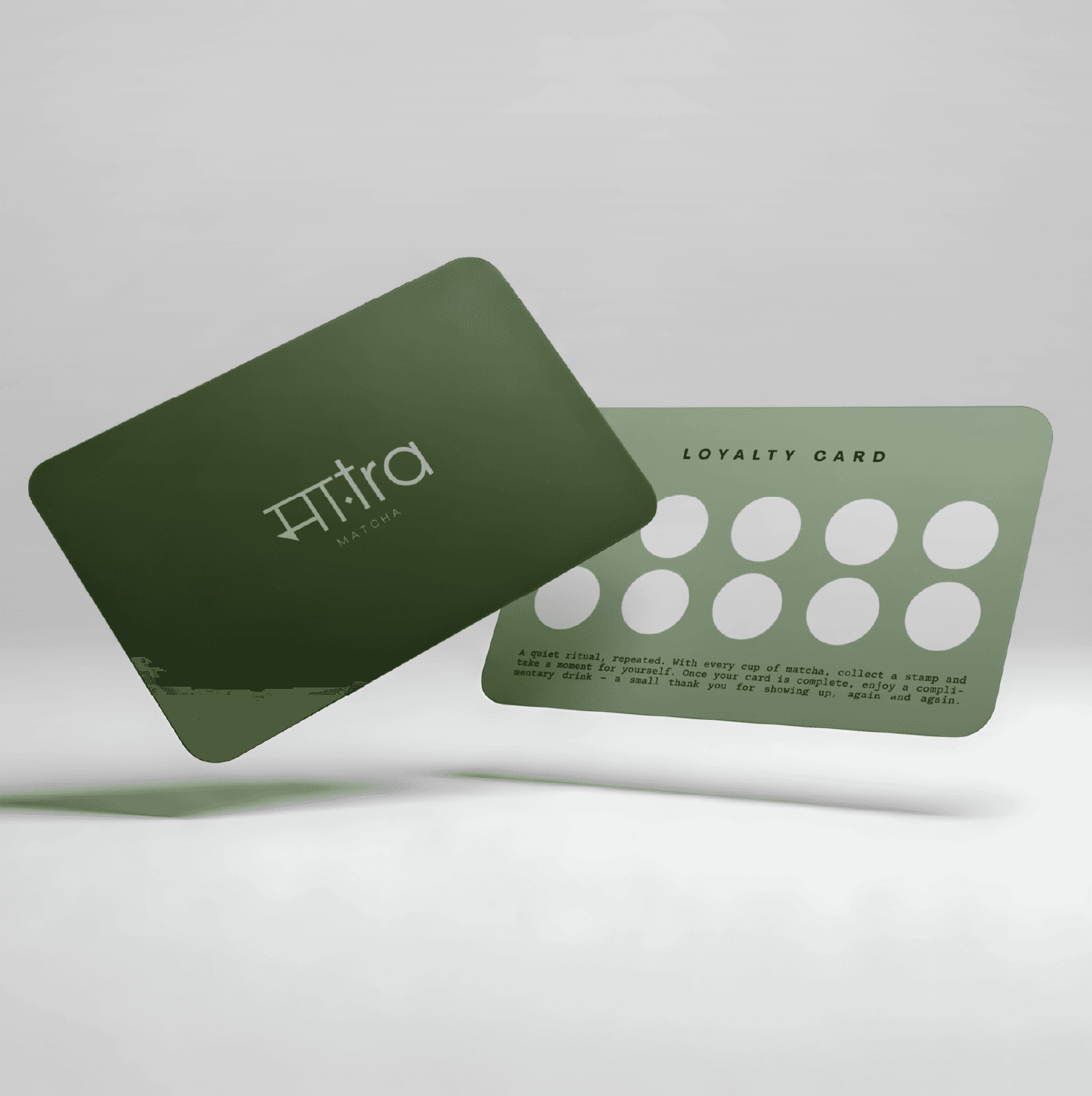
For Matra Matcha, Fomo Media developed a tranquil and grounded brand identity inspired by the ritual of daily matcha. An earthy palette of moss, sage, and matcha greens paired with a bilingual logotype extends across eco-friendly cups, beverage carriers, and loyalty cards, creating a mindful and serene brand experience.

Services:
Brand Identity + Stationery Designs
Industry:
Food & Beverage Brand
Timeline
8 Weeks
The Challenge
As Matra Matcha prepared to introduce its brand, it faced the challenge of translating the deeply mindful, serene experience of a daily tea ritual into a commercial identity. Without a carefully crafted visual strategy, the brand risked feeling like a fast-paced coffee shop rather than a tranquil sanctuary, failing to communicate its organic roots and the grounding essence of its matcha-making process.
Lack of a distinct brand identity that captures a quiet, ritualistic feel
Need for a balanced, bilingual visual solution that honors local roots while staying modern
Absence of unified, eco-friendly packaging and retail collateral
Risk of blending into a crowded, fast-casual beverage market
The Solution
We developed a tranquil, grounded brand identity centered entirely on the concept of a quiet, repeated ritual. The visual language was anchored in an earthy, organic color palette of deep moss, sage, and matcha greens, balanced by soft, calming neutral creams. We designed a striking bilingual logotype that merges Devanagari script with clean modern lettering, and seamlessly translated this aesthetic onto eco-friendly paper cups, a minimalist corrugated beverage carrier, and refined matte loyalty cards.




The Result
Matra Matcha now delivers a beautiful, cohesive design ecosystem that perfectly mirrors the mindful experience of a daily tea ritual. The intentional aesthetic establishes a powerful emotional connection with customers, transforming a simple beverage purchase into a serene, memorable routine.
Deepened emotional resonance with mindfulness-focused consumers
Highly cohesive and visually soothing in-store and takeout presence
Successful integration of bilingual identity and eco-friendly messaging

